OTT & CTV Ad Reporting
Most OTT reports look impressive. Clean dashboards. Big numbers. Fancy graphs.
But here’s the ugly truth: most of them are designed to confuse. They hide more than they reveal. They look smart to keep you from asking real questions.
We’re not here for that.
We’re going to break down the do’s, the don’ts, and the straight-up WTFs of OTT reporting—with real examples from the trenches.
1. Start With the Basics. But Make Them Clear.
Let’s look at a clean campaign summary. Real campaign. Real numbers. Real clarity:
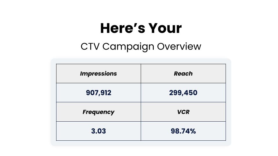
You get:
- Total impressions
- Actual reach
- Frequency (how often your ad hit the same household)
- VCR (Video Completion Rate)
But here’s the catch: all of these numbers mean nothing if the definitions behind them are fuzzy. Is reach based on IPs? Users? Devices? If your vendor can’t tell you instantly, that’s a red flag.
2. When VCR Becomes a Vanity Metric
Here’s how competitors often show off their “amazing” completion rates:
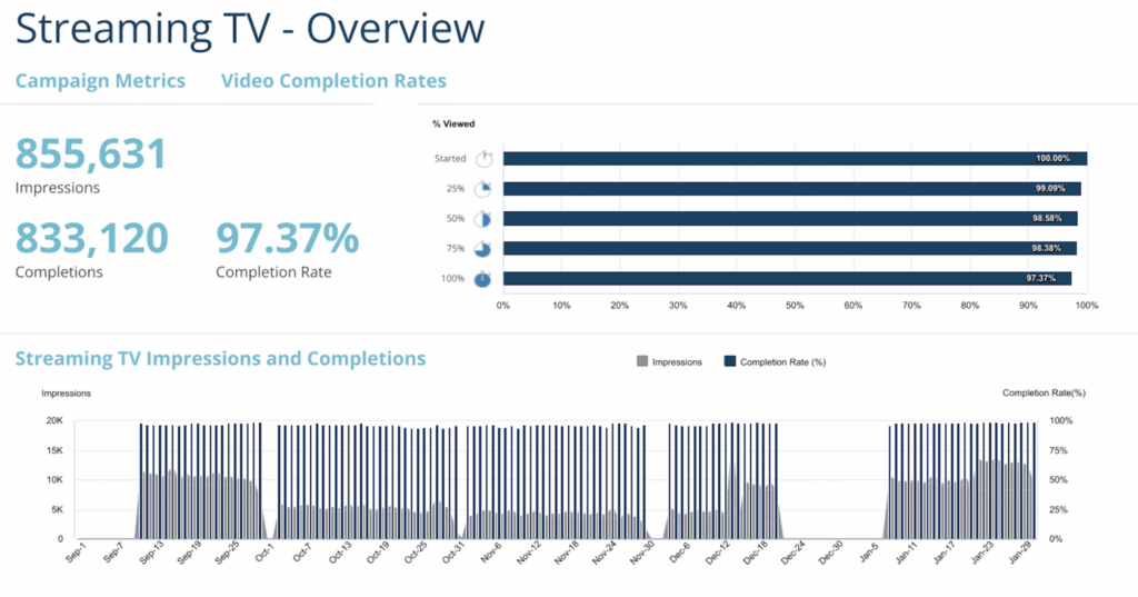
Notice anything?
- Multiple charts saying the same thing
- Completion rate is sky-high—because it has to be (you can’t skip CTV ads)
- Zero insight on where fraud or non-CTV delivery might be hiding
It’s fluff. Pretty fluff. But fluff.
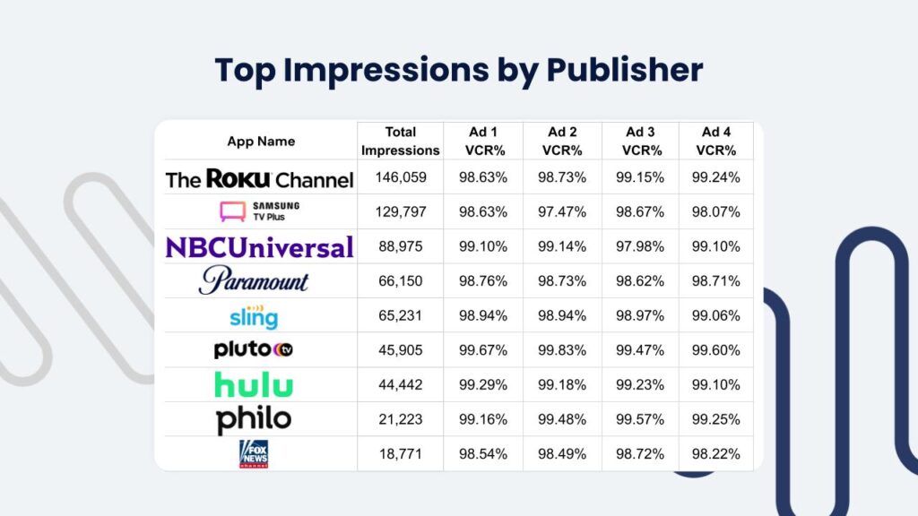
Unlike most vendors who bury performance in blended averages, we break VCR out by app, publisher, and campaign.
Why? Because that’s how you actually spot fraud, non-CTV delivery, or underperforming inventory.
If your report can’t show this, it’s not reporting… it’s theater.
3. Time-of-Day Reporting: Obscured On Purpose
Now let’s talk dayparting. Competitor reports love vague visualizations like this:


What do you actually learn from these? Nothing.
- No hourly data
- No real context
- Just colorful distractions
4. Daily Data Should Mean Something
Vendors love to break things down by day… but without scale. Check this out:
See the problem? Sure, they tell you completion rates are consistent, but:
- There’s no Y-axis for starts
- Everything is within 1%
- It’s meaningless noise dressed up as optimization
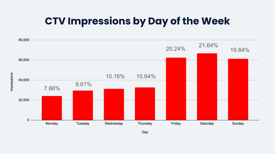
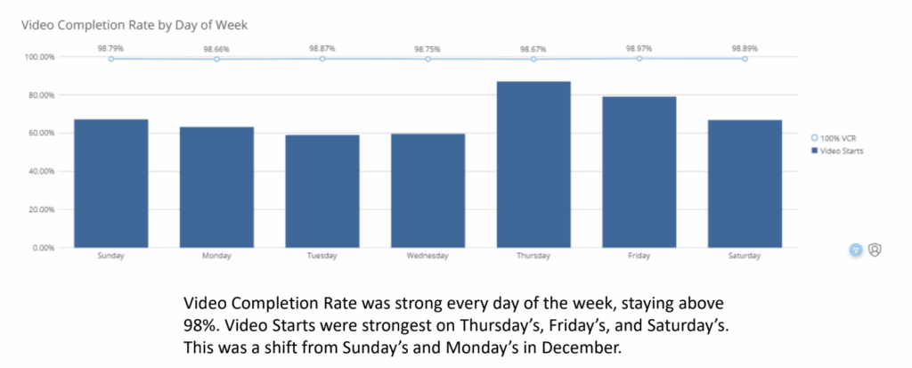
Now contrast that with this.
We don’t pretend 0.3% changes in VCR are revelations. We show you exactly how your campaign delivered, by day of the week.
You see real pacing. Real distribution. And real opportunities to optimize.
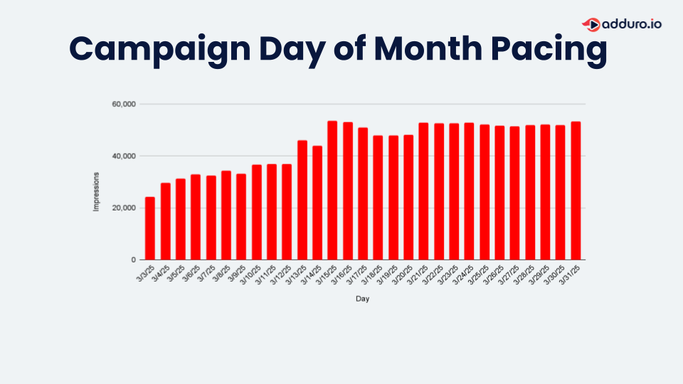
And we don’t stop at weekly summaries.
This is how we show you full-month pacing — day by day, no black box.
You’ll know exactly where your spend went, which days overdelivered, and where optimizations should land next time.
5. Reports Should Help You Decide
Your data isn’t for decoration. It’s for decisions.
That’s why Adduro reports are built to surface anomalies, not hide them. Every number is contextual. Every chart is actionable. And every campaign is customized—because no two advertisers care about the same exact metrics.
If your OTT report isn’t helping you find problems or improve performance, then it’s just there to keep you quiet.
And that’s a problem.
Final Thought: Bad reporting wastes your money. Great reporting helps you spend it smarter.
We’re here for the latter. And the next parts, we’ll go even deeper.
Until then: kill the fluff. Demand clarity. Get smarter.